Azure Application Gateway Charts
Azure Application Gateways provide a reverse proxy Layer 7 load balancer solution in Microsoft Azure. From a PaaS point of view, they’re very handy, providing full Azure integration for deploying through ARM, PowerShell and CLI. There are other options out there, such as Nginx, F5 ADCs and even Apache, but these don’t have that same level of integration with Azure and must be manually configured after provisioning. App Gateways also can be run as Web Application Firewalls to provide a good layer of security between the public Internet and your web servers. Using OWASP3 rulesets, they can detect and prevent common attacks such as SQL Injection and Cross-site-scripting (XSS), though they are no replacement for good application and data security.
The main reason for my blog post today is a concern I have about the terminology used when observing the capabilities of each Application Gateway SKU or tier and how that translates to what you might see in the portal. More specifically, the problem I have is with the Application Gateway’s chart which lots and lots of people will be looking at and thinking it’s throughput. Well, that’s what it says it is and technically, it is, but what it isn’t is a chart measuring throughput over time – the trouble is, that is what it says it is. Here’s an example chart from an Application Gateway. If you look at the chart, it says that the App Gateway peaked at 21.4MB/s and has a Total of 71.21MB/s. This chart shows over a time period of about 25 days and gives data samples for plotting on the x-axis hourly.
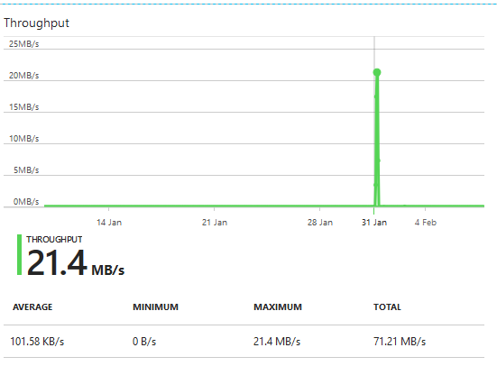
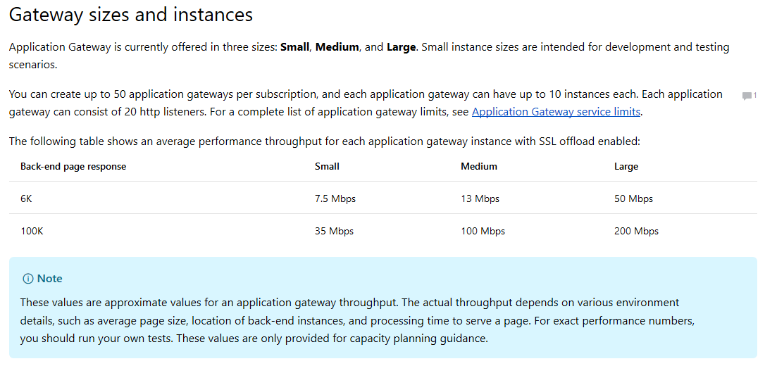
My first question is….21.4MB/s? Isn’t that ~170Mbps? Bearing in mind I know this is a 2 instance Medium SKU WAF and the numbers of users on the application that this Application Gateway is delivering during this period was ~100 – there’s no way they were generating 170Mbps traffic at peak. While 2 instances of a Medium SKU WAF Application Gateways can achieve that figure, that assumes the page response is close to the 100K benchmark Microsoft mentioned on the Application Gateway information page.
My second question is, why is there a Total on the graph measured in MB/s? How does one total up throughput when it’s already measured against time? Throughput over time isn’t ever totalled. Data that has been processed or that has egressed a system can be but it would never be shown as MB/s (Megabytes per second) – more likely simply MB (Megabytes).
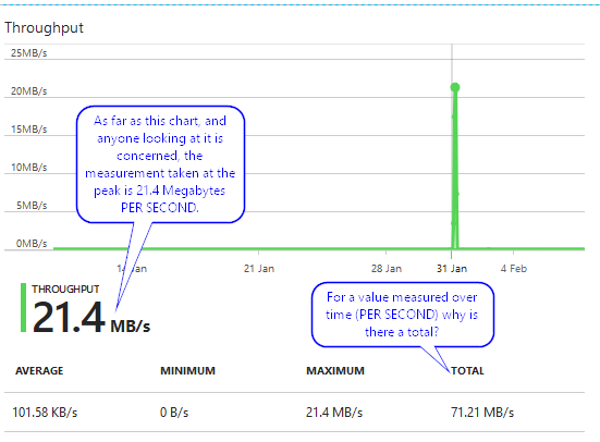
The reason for this confusion is based entirely on the visible qualifiers in the chart and the use of the word Throughput. While the use of Throughput is technically correct, it is misleading in the context of the information and qualifiers provided in the chart. You only really understand this when you zoom in to an area of interest. Obviously for us, that’s around 31st January….so here’s that chart zoomed in to a 5 hour period.
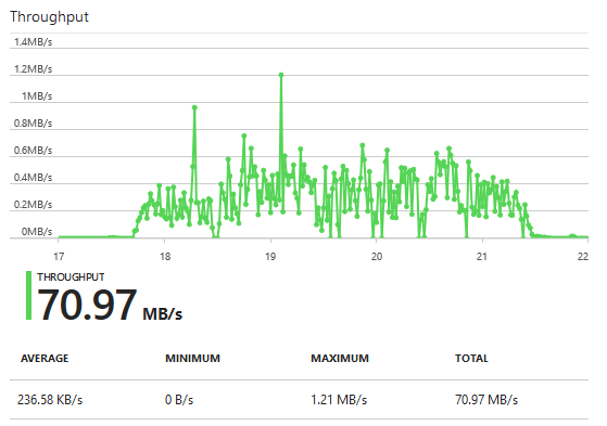
So…if the measurement of 21.4MB/s in the original chart image were an accurate representation of the throughput per second (which is what it says it is), if we zoomed in to that peak area, it should still be 21.4MB/s since the data points are apparently per second. The problem is that isn’t the case in the zoomed chart. How can that be? The total is still there and showing ~71MB/s (having removed some obviously small usage in the areas outside that peak on the original chart) but it looks like the peak has just been squashed to make it wider. It’s for this reason I believe the chart is not representing throughput per second but is instead representing simply data processed.
If indeed the data samples are taken each second, they are a snapshot of throughput at that specific moment in time when the sample was taken. Typically for per second, this means that the sample is taken each second and each subsequent sample lives by itself as a point-in-time but that an average can be calculated by adding the sample figures and then dividing by the number of samples.
For example; if the users of the application were generating a consistent 10Mbps (Megabits per second) throughput, over the course of a 1 minute period, they do not generate 600Mbps (10Mbps x 60 seconds). Their average is still 10Mbps. If indeed there is a consistent 10Mbps, the calculation as an average so should be: The sum of all of the sample results divided by the number of samples. If the samples were always 10Mbps and the samples were taken each second for one minute then (10+10+10+10….60 times….+10) / 60 (samples) = 10Mbps. This approach doesn’t change whether you’re looking at each individual sample result from each second or data on a chart over the course of one minute, one hour, one day etc. If the samples are taken each second and your data points are only able to be represented every hour, you have to sum all of the data samples and then divide by the number of samples. Given that’s an hour, if you had taken samples every second for an hour, you divide by 3600.
The elephant in this room so far is that we’re talking about throughput measured in Megabits per second (Mbps) when the chart itself actually says Megabytes per second (MB/s). I think the fundamental reason for this is that, as mentioned above, the chart is actually representing data processed. It isn’t throughput per second or anything of the sort, simply data processed (in Megabytes) since the data represented by the chart are totals of data making its way through the Application Gateway.
Looking at the data points in the original chart, the peak shows 21.4MB/s. I’d say this data point is supposed to represent a one-hour interval. If we look now at the zoomed in view, if I were to run my mouse over each data point on this diagram for a one-hour time span and add up all of the data samples, my expectation is that we’ll see an amount near that 21.4MB/s we see in the original chart. What I think has actually happened is that because this is a chart reflecting data processed and not throughput per second, when the data points are reflected as hourly intervals as they are in the original chart at the top of this post, they show the amount of data processed in that hour as an accumulation. If we zoom in on the hour, we see the data processed within a one minute sample so we could easily add all the samples up if we want.
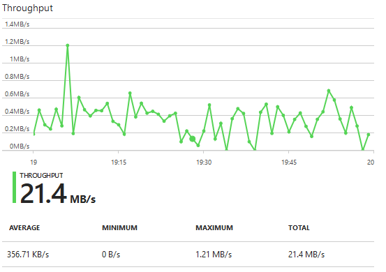
If we look at the figures shown by this latest chart, where we focus on an hour time slot, we see that the Total is…surprise…21.4MB/s – if that sounds familiar it’s because that was the Maximum figure at the highest peak from the original chart – where the data samples are represented hourly. It’s clear to see now why the chart is misleading and the use of incorrect qualifiers also causes further confusion. We don’t need to total up the amounts from each one minute data sample because we can see a clear correlation between this zoomed in to one hour view and the data sample on the original chart that shows the peak of “21.4MB/s” at a one hour sample.
The fix is simple really. Remove the use of /s qualifier in the y axis and the summary information and change from using Throughput as the chart title to Data processed. I’ve no doubt this is far easier than trying to represent actual per second throughput on this chart.
-Lewis
